Thursday 16 December 2010

Peacock Gallery Art Exhibition Newspaper review

Pupils astonish public as Recycling exhibition takes centre stage


Maiden Erlegh Pupils have, yet again, reigned supreme in their current exhibition held at the Peacock Gallery.

The year 9 students who have taken Art as one of their 4 chosen options have created an inspiring display of their 3-D and 2-D artwork. They were given the recurring theme of recycling as the base point of each individual piece that contributed to the finished product. This meant that their imaginations could go wild with the different media usage and whether to create 2-D or 3-D pieces.

The Medias, which were all recycled in some way, were; cardboard, wire, packets of crisps, tea bags, old curtains/material, egg cartons, sweet rappers, melted crayons, books, newspapers-the list is endless. But the brilliant thing about these pieces is that they are all completely recycled- not using ready made materials but looking around us and appreciating how much material we would normally throw away with out thinking and how we can turn that into a piece of art.

I have visited the exhibition and all of the pieces were eye catching and brilliant- although- there were a few pieces which because of their simplicity or intricacy really caught my eye.

My first favourite picture was by a fellow pupil called Hannah Ng:


I particularly liked this piece because it had encapsulated the meaning and idea of recycling and creating new things from the old. The artist has made four origami cranes and has made them, cleverly, seem like they are flying away from the book-maybe meaning that they are breaking free from the book into the world-showing how the world wants to break free and care about it more.
I think the main reason why I enjoy this piece is the contrast in colours between the solemn monotone book paper and the bright, blue, abstract collage in the background. She has smartly used different shades of blue onto the shoe box which makes the conceptual square and corner-like background. This makes a real difference to the duller tones of the book which is really what makes the piece so interesting to look at.
 I also like how she has used the shoe box to hover over the piece- and make it enclosed so there is a definite ending to the piece outwards-but- there is not definite ending to the piece as it comes out to you; so you can see every nook and cranny of it. An overall great effort- and one of my favourite pieces.

The next eye catching piece was called ‘My Bionic Bird’ by Isaac Robinson,


 I like this piece because of its intricacy yet simplicity of materials used. He has simply collected a large amount of wires and by using a weaving technique he has intertwined the wires with a structure made out of chicken wires.

The colours have worked particularly effectively because the red and green and the hint of black all merge together from the wires to create a lovely silhouette when light is shone through it. I think that this has successfully reached the brief of being recycled; as it has that reused feel. It was displayed by being hung from the ceiling with clear string which gave the illusion of the bird really flying; adding to the execution of the final piece  and the realistic components of it.

The last piece that really stood out in the gallery was by Tom Ryan;


 This piece amazed me at the exhibition due to the eye catching, pop-out piece of art which literally pops out!

He has made this by creating the hands out of rolled up newspaper and stiffening it with glue. He has then modelled the hands to the suitable position of someone drawing-which adds to it as it is in an art lesson. After he had completed the hands he used a book which I believe was from Oxfam books where they were going to throw away it and then stuck them together at a slight angle.

He added extra details and frills by adding in the ripped pages from where the hand has burst out of the book and into reality. I also liked how he added the simple touch of putting a pencil into the hands to add a small jolt of colour. This is clever because it lets your eyes focus on different things in the piece- and not get bored. Adding all of these supplements creates the piece to be more and more realistic. So realistic that I feel like I could actually touch the hand and it would respond and start moving.

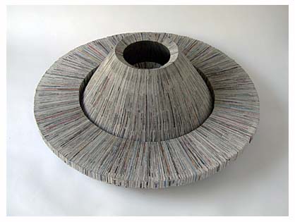
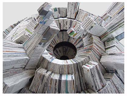
The simplicity of using just recycled paper really made the colours and the overall sculpture much more interesting because you would have newspapers with stories that you could spot, colours from advertisements brightening the piece and the black and white text and background giving it a solid colour scheme.
This topic of recycling has taught the year 9’s so many techniques of 3-D art that can be used much more. But it has also taught us that we really can create something from nothing-or in this case-rubbish. We have also learnt and discovered how many artists have created such amazing ideas and projects all from recycling and reusing.

Recycling really is a good idea, especially when you are creating art, because unless you try, you can never find out how many materials that could be made into something amazing are being thrown away every day and how you can easily create them into something new.
With all of the news surrounded with claims of global warming and cutting down of the rainforests making a few pieces of paper into a sculpture or collage makes use of what we would usually waste. I think all year 9 students should be proud of the work they’ve done-after all, at the age of 13/14 you have already had a piece of artwork in a gallery!
So, why don’t you give it a go?
The art exhibition overall was a complete success and it is open until the 16th of Decemeber. You wouldn’t want to miss it. Get inspired!

Saturday 4 December 2010

My final piece outcome

To conclude my recycling project and to put all of my skills I have picked up into test I decided to make a final piece to show what I have learnt about this project.

My final art piece which I decided to do was a small model village inspired by the Vincent Van Gogh painting ''Starry Night''. Starry night is exciting and complex to look at because of the intricate swirls and the fact that everywhere you look there is something happening that can catch your eye. There is also a very calm, sorrowful colour scheme of cold blue colours. This is effective because it is not harsh on your eyes; the colours calmly blend together and create a soft swirl of sea colours drafting around the sky- almost like it is moving.

Many things concluded to my final outcome to make it the best I could. Because I had created during this term and learnt about 3-D projecting forms I decided to stick with the idea of 3-D; so I could show how I have picked up new skills and techniques. I looked at my flower which I made to come out of a book I made a few weeks ago and thought that was a very predominant and eye catching design because of the size and the complex collaging f the plant and decided to make a 3-D piece in small relation to that.
During the half-term of the project I was asked to make a small piece of artwork that was to show what I had learnt so far and also had relation to our theme of recycling. We were given a website address for an artist called Tom Hunter who's work  was inspired by the Art from Art range of work in which you take an old painting and recreate it to be relevant for your times; he has done many of these sorts of pictures.This inspired me to make a 2-D drawing of Vincent Van Gogh's starry night. I created it with pastels to create the swirling smoggy effect. To make this relevant to this day I created the village in the picture to be an industrious town that created light pollution to show how the world has changed since the 1800's.
Tom Hunter is an internationally renowned photographer who has exhibited in many places. He was also the first person to have a solo photography show at the National Gallery in London. He is known for making very contemporary pieces that depict life as it is today- often with a melancholy feel. He also takes photos of people and organisations who live in Hackney, to show diversity and multiculturalism. He also uses the borough in London Hackney a lot in his photos;he currently lives and work there. The pieces that I focused on were his Art from Art pieces.
One of my favourites is Two Men Wanted which is a re-incarnation of the piece A Satyr Mourning Over A Nymph. What he has done is after analyzing an old  pre-raphaelite (such as Ophelia of the spirits) painting he decided to create a slightly dissimilar remake of it, but in today's context. He did this by photographing two people in modern day clothing- although one of them ,like the painting, is on the floor dying. This shows that losses can be made- even if they are not dramatised or on the news- like many of the crimes that are unreported in Hackney. He has used a copper back light to compliment the colour of the layered leaves and has achieved rich colours making the whole piece eerie and still, and quite haunting to think about.

Two Men Wanted and A Satyr Mourning Over A Nymph

After I had looked at ideas from other artists I decided to continue with the idea of recreating Vincent Van Gogh's piece.I then advanced with the idea of Starry Night but then thought of an idea of turning my 2-D drawing into a 3-D model village; doing this would be more in-keeping with my projects and work I had done before.


This is the painting that inspired my final piece. You can see that in this painting you can make out old Tudor fashioned houses and a steeple church in which I kept in my piece so it had slight resemblance to the piece.
Before I properly started on my piece I created a smaller version maquette so I could make a decision on what I would place where and what materials I would use. This was extremely helpful because I could see my final design in  a smaller scale but in a correct one so I could still experiment without making final decisions.
I made my final outcome by firstly obtaining  three pieces of corrugated card. I used two of them for the         backing and also the surface of my created piece. I then used the other sheet of corrugated card to create the miniature houses in the village. To make these it was very complicated work. I had to design a net for  the boxes and rectangles that were made into a 3-D house. This was extremely complicated and fiddly because I had to slot each tab on one of the faces of the cube into a space(this took a lot of tries and time!) To keep with the recycling theme the only glue I used was left-over from classes before so I didn't use up brand new glue. Also all of my media which I used was recycling and would have otherwise been thrown away.
To make the trees I experimented with lots of ideas but then I found a brilliant material of the inside of an egg carton to be it. The shaping is perfect and the texture was rough and it looked like leaves had different layers. To create the church I had to create a net for a cuboid to make the long steeple which was even more hard to create and stick together due to the longer therefore more fragile. I wanted to vary the size and shape of all of the houses otherwise the whole piece would be slightly repetitive. That is why I created the church- to give more varying structures to the scenery.
I also changed the sizes of the houses so when you looked at the piece the perspectives are correct. When you look at something the sizes of things change e.g when you look at a person close to you and then a tree metres away the person looks extremely large compared to the tree. If you do not get the perspectives correct then the piece looks out of proportion and not right. By making the houses far away smaller and the houses nearer to the viewer bigger then you can make the proportions more accurate; this was a main aim for me so my piece looks slightly more realistic.
To create the roofs of the houses I still wanted to keep the same sepia coloured colour so I used the other side of the corrugated card to compliment the colour of the light brown. This also created a nice wood-logged feel to the roofs so it looked life the roofs were logged. I also used tissue paper and scrunched it up to create a textural effect of shrubbery and grass. I also used different shades of tissue paper in the sky to create a spiralling, confusing effect that made everywhere you look a different swirl. I also added different media use but still kept in the same colour palate.

There were many  alterations in which I had to make while in the process of making my miniature village such as I started making the nets of the houses out of thick cardboard which made the folding extremely difficult therefore I had to change the cardboard to corrugated to make the folding easier. I was also contemplating whether I should add the black figure in Starry Night to show the resemblance. In the end I decided I show make it my own and I did this by not including the black figure and instead placing a farm by putting down corrugated card and flat tissue paper over it for more layering. I felt if I left out the figure I could make the piece more of my own and keep in the theme of Art from Art.
I also thought of adding LED lights to make the piece more like Starry Night- but if I added these I would have to set up a circuit and it would make the background more complicated than it needed to be. It would also draw the eye away from the main focus which is the architecture of the houses and church.

I am happy with my final outcome because It is what I had imagined and pictured it to look like. I think I created different focuses in the foreground, background and middle ground so the whole piece is eye-catching and intricate. I have so many things that I could improve it by. One of these things is that I wish I could have added stained glass windows onto the church. I would have done this by using tissue paper or sellaphane and stuck it in a window carved in. This would have made the piece much less simple and more intricate. I could also have added in LED lights but like I have said they could detract from the simplicity of the piece. I also had an idea of setting this scene on the pages of a book in which I saw in a shop in town. If I had made the houses and everything smaller I could have fitted it onto a page and it could have created a deeper story line. But overall- I think I executed the piece with justice and I think that the simplicity of the town and then the wildness of the sky creates a real contrast- making the piece much more aesthetically pleasing in my opinion.

Here are some pictures of the construction and planning of the piece-

My maquette
My final piece

My net for my houses

My mind map and testing of ideas

My first concept art and Ideas

Friday 8 October 2010

Bottle slumping

In another lesson we learnt how to create a holder for our slumped bottles.

Bottle slumping is when you put a wine bottle into a kiln and it 'slumps' into different shapes a can make a holder or many other objects.

We decided to make the holder for our bottle out of clay as it will not melt in the kiln and will mould the bottle into the correct shape.
The equipment we need are

-A mat                       -A water pot
-A rolling pin              -A knife
-A fork                       -Clay                 -Cheese wire

The instructions we decided on are as written down,

Firstly you cover the Wine bottle with paper towel and masking tape,
Next you use the bottom of the palm of your hand to flatten the clay evenly.
--the slab thickness should be around 1cm and the length of the bottle plus a few cm.
After you cut around the slab to the rough shape of the bottle.
Place the slab on top of the Bottle
 Then take four pieces of clay and roll them into spheres.
At four points cross hatch a small part.
Cross hatch the four spheres on one side
Use water to stick the spheres on the slab
Then mould the spheres so they become more into four stands to prop up the bottle
Leave for 2 weeks until it becomes bone dry
Place in kiln at 1100 degrees celcius

This is our plan for bottle slumping, this is what an actual slumped bottle will look like,

Recylced Flower making

In one lesson we experimented with making flowers from recycled magazines and cardboard. We started by rolling up a double sheet of a magazine finely into a very small tube.
We then used masking tape to secure the edges and cut off a few centimetres at each end.
Taking a pen I rolled 6 pieces of 2cm wide cardboard strips  until they curled. I cut the bottom end to be thin and pressed it so it could fit into the slot at the top of the roll.
 I then did this for the other 5 strips experimenting with size and shape until I couldn't fit any more inside.

The class then put together all of their 'flowers' and created a cool looking bunch of flowers!

Relief Form

This lesson we moved from working with books to working with magazines. We were given the brief to recreate in our own way the work of Cara Barer- particularly her piece Sea Nettle,


To create this we were given a section of a magazine that had been cut at the spine so it was divided up. We then spread out all of the pages and started to roll them up and curl them.
 Adding another page at a time we used paper clips to secure them to each other.
We wanted to make sure we kept the feeling of Sea Nettle by making sure the piece almost looks like it is floating in the air so we kept that in mind.
Once we had paper clipped the whole of the spine we used a glue stick to secure the pages together.

Cara Barer has also done many other pieces in which she made look like they are floating in the air.
For example Argon has the same structure except colour has been injected into it making it slightly more eye catching than the others.
 It is also more study looking than Sea Nettle due to the fact the pages are more sticking out and straighter.
    Aragon by Cara Barer


Here is my attempt


I am quite impressed with how quite a simple constructing of the piece creates a complicated looking sculpture and I think this is effective.
I do think that my piece isn't as good as Cara Barer's  though because she used every single sheet really neatly and used a whole book as we used small magazines and glossy books so the loops and circles were more floppy and the radius of the circles were bigger, not squished.


I am very happy with how my sculpture came out because I was given a much smaller book therefore there was less width to be creative with. But there was an advantage, my book was much more sturdier and therefore not as floppy as everyone else's. This did make my book much more easier to move and to stick into place in my opinion.

I have connected my piece well to Cara's because I have tried to recreate the feeling of being weightless ,which is what I think most of her pieces are showing, and to create the swirls and circles that you can't see the beginning or end of and they finish in many unexpected places.
I also think that I have used spacial awareness and variety, not just making the same shaped loop every time, but varying the size, rhythm and structure of each individual curve.

Monday 4 October 2010

3-D projecting form

This week we moved from 2-D work into 3-D artwork. The last few weeks we were creating 2-D flip up books but now- after being given a new book with a completely new genre we made, using newspaper (all recycled), something from the contents of the book to come to life and pop out of the book.

I was given a book that was all about botany and particular plants. I brainstormed ideas that I could use and in the end- because the flowers had big petals and winding vines I decided to do a viney flower blossoming out of the book. Also, to create maximum effect I stuck down ripped pieces of paper to create the look of the flower "bursting out of the paper".

We actually created the basic structure by rolling up recycled newspaper and modelling it using firstly masking tape. Then, after we had left it to dry, the next week we started to add colour or text ripped from the other pages of the book. I ripped out all of the green pictures and images and, using PVA glue stuck the small pieces on. I then used different yellow shades to cover the head of the flower. My art was not very sturdy, so I decided to use a twig from outside my classroom to prop up the sculpture. I then thought it looked quite natural so I decided to keep the twig.

This is my finished product-

A birds eye view


I am extremely surprised with how sturdy and well my pop out sculpture came. I am surprised because when I first started using the newspaper to sculpt the stem of the flower was extremely unsteady and I thought I may have to start again or try to make it more sturdier. But by adding a liberal amount of PVA  glue that helped make the base much more sturdy and supportive.
If I could improve it in any way I would try and use shading and make the colours that cover the flower much more obvious and easy to see e.g that leaf is a lighter yellow as the leaf at the side is more orange. This would make the piece much more aesthetically  pleasing by the colours blending in and making the flower more smooth and have the same texture of the flower.

My artwork closely resembles the artwork of sculpture Sachiyo Yoshida. As you see, I tried to closely replicate the 'bursting out of the pages look' which Sachiyo cleverly made here. But differently to my work this is much more sturdier because the artist most likely used wire to sculpt and hold up the shape of the ram, and then using the pages and alot of glue, maybe papier mache to make the 'skin' of the animal.

Sunday 19 September 2010

2-D Flip art

On Friday 17th lesson we started experimenting with using
 2-D flip art with our recycled books from Oxfam.

On the 9th of September we all got given randomly a book in which had been collected from an Oxfam shop in town. We were then given the task of finding out what our book was about- In my case I got a romance book called 'Dreaming of a stranger'. We then had to think of scenes that would sum up the synopsis of our books.

I decided to do a woman sitting cross legged at the beach to show a woman dreaming. We drew these on the inside covers of our book to save using and wasting paper. We wanted to use as little paper as possible.

We then had to actually create these scenes.We did this by firstly taking the middle 5 pages from each side and glued them together to make the pages thicker and more sturdy.

Then, after a week of drying, we took them out the next week and took a knife and a carving mat. Before carving we firstly planned out where we would cut and drew in pencil around. We put the carving mat underneath one of the sturdy pages and slowly and carefully cutting around the objects- making sure not to cut around them fully,but missing out the base of it so it can be popped up. We scored the base so they would hold up easier.

Firstly, here are the pictures of my draft sketches, drafts, the book and the finish product-


My Book- Dreaming of a Stranger


My drafts and sketches inside the front cover of the book


The view of my cutting of the book from the top


What it looks like- (my first ever try!)


The idea of flip art is from many artists- one being Sue Backwell who did a scene of a forest,Su Backwell 2

Another one is by an unknown artist who did a piece called 'Alice at the Mad Hatter's' which is actually 3-D pop up as opposed to 2-D pop up

Alice at the Mad Hatter's

Another one is again from someone I could not find the name of. This artwork is amazing because it looks like it was so intricate to make. It is called 'fables'

Fables

There are also many more artists that use the same technique.

Creative Tom Phillips

Tom Phillips was born in London in 1937 and is probably
most famous for his 370 paged artwork called 'The Humument'.
These pieces of artwork helped him get a solo exhibition at the
National Portrait gallery exhibiting other works of his as well such as a portrait
of Dame Iris Murdoch, a novelist.

The Humument is created by getting a page from a book and then covering up by paint or by wax crayon most of the works, leaving only a select few words left that all make sense and create a story or a meaning of some kind.

My favourite Humument ( meaning Human Document because that was the paper he used originally) is page 202 because although it is black and white you can see how he has used mark making to cover up the words that he doesn't want to use.

See caption below                    This is page 202 of the Humument

Anther one of my favourite pages of the Humument is page 334 because it is much more abstract and slightly harder to decipher the actual message,

See caption below Page 334 of the Humument

Wednesday 15 September 2010

Quick extra read!

I was looking through a website when I found this amazing 3-d book sculpture- I love the whole fairytale, ships and castles theme and how the artist has created platforms from the text in the book!
Departamento de Mistérios

This piece is called Departamento de Misterios


The website is http://vi.sualize.us/view/amira/40c086c619000e4d9136008ce781dc3e/

Sunday 12 September 2010

Ros Rixon Recycles..

Ros Rixon's main artwork are sculptures such as 'spheres' and the 'Full circles'
project but Ros also made a project of 'Book Pages' and sculptures
that included a book sculpture called
               ' Artists at work'


This must have taken a long time to create because of for each page
 of the whole book the artist has stripped off hundreds of little pieces and
made them hang just out of the width of the book and has created an intricate,
 exciting sculpture to look at from different angles because it is on a pedestal so you can look at it from 360 degrees.
I think that because of the complicated paper the colours are better being slightly
duller and more sepia toned to make the book look more aged and old.


So that's all for Ros Rixon and I will keep posting if I see any more good artists!

Book-Artist Supreme Cara Barer

Cara Barer is most likely one of my top 'book' artists. 
Her photographs are (quoted for her portfolio) 'a documentation of physical evolution' 
I think this is a great way to describe her work. As I post up her photos you can start to see how elements such as air and water and fire and earth influence her work.

           Sea Nettle 2008 by Cara Barer

This photograph is very interesting to look at because of the rhythmical swirls and pattern that the book's pages create. 
Thinking of the elements and 'physical evolution' theme the book looks like it is submerged in water or levitating in mid air.
 I think this piece is effective because the black background makes it look even more like it is levitating on mid air. 
I also think the two toned black and white look makes the colours pop out more and look more contrasting which contributes to a more eye-catching photo.

The next piece of her work is called 


Argon again by Cara Barer

This piece is quite similar to the last one except to make it different
 and stand out from the other photos she has used magazines to make the paper glossy  
and different bright primary colours to be different from the black of the background and white of the paper.


Well that's Cara Barers' artwork I have analysed briefly- you will soon be seeing  the work of Ros Rixon coming up!

Friday 10 September 2010

Eco- Artist Yoshimiki Hara

A brief biography of Yoshimiki,

Living in London, Yoshimiki is an artist that has recently
 used raw materials including newspapers and books.

Here are some of her pieces of artwork

(Unfortunately I couldn't find the name of this piece...)

This piece is extremely intricate because
 it is actually made from folded up newspapers glued on layer after layer.
This makes it sturdier.
I think the simplicity makes this piece much more effective.
 You then zoom into the artwork and find the hundreds of pieces of newspapers squeezed together.
Only then can you really consider the amount of time it must have taken to make.

( Also no name unfortunately.)


This piece is quite similar to the last one except there are much more chunkier pieces-
more ragged and sharper sticking upwards and outwards.
This is again another great piece of artwork that I extremely like.
This is probably because of the monochromatic colour of the newspaper but then if you focus you can see the odd colour of red or blue which brings the piece alive. It brings the piece alive by spritz of colours engaging the viewer's eyes and making the piece much more aesthetically pleasing.
The main shape of the sculpture is simple yet the main shape is made by complicated newspapers.


That was my first Eco-artist......
2-3 artists to go!
There are many, many established artists that use specifically recycled and recyclable media in their art work.

These artists include the likes of--

Tom Phillips,
Ross Rixon,
and Cara Barer,

(Of  whom later blogs will let us discover more about them)

There are also many other artists that use recycled materials as their main media of artwork.

But- I am looking I one sort of recycled material---

''Books''

Of which Ross Rixon and Cara Barer have both created pieces of art with.

A recyclable introduction..

Hello my name is Abigail and this is my fully eco-friendly art Blog.


This term my art class has been given the theme of "Recycling" to create 2-D and 3-D artwork for an exhibition in the gallery at our school. Everything would then be made by completely recycled materials.
Each class has then been given a specific topic inside of Recycling. We all focused on 
"Books" 
So through out the term we will be experimenting with different medias to create 2-D and 3-D art. I will be using books and recycled objects.